Arranger Charts
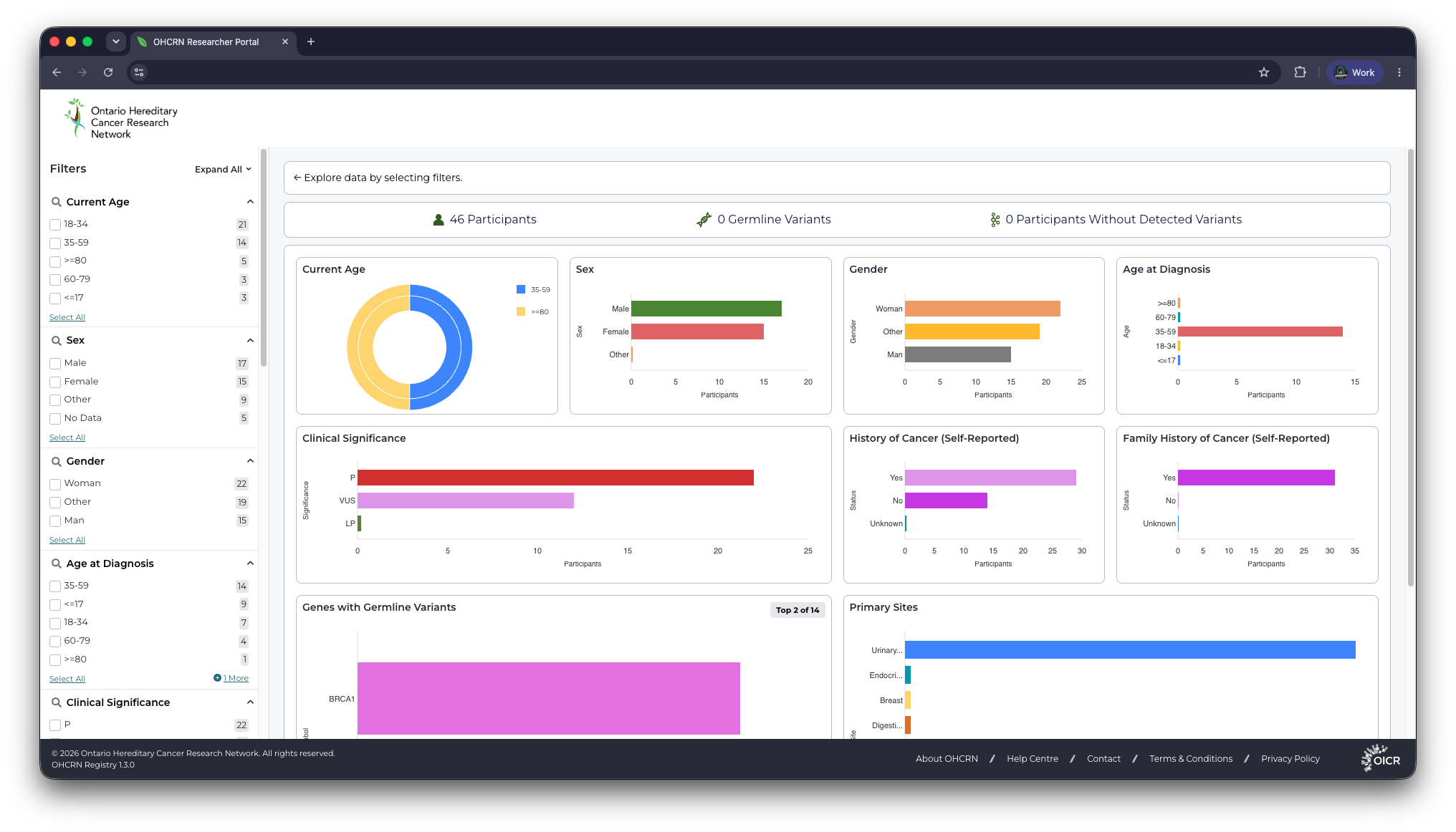
Arranger Charts (@overture-stack/arranger-charts) is a React chart library for visualizing the aggregation data an Arranger server returns. Charts read the catalogue and SQON state of the search interface they sit in, so every chart re-queries when a user changes a filter.
Charts under one ChartsProvider are fetched together: each chart registers the field it needs on mount, and the provider builds a single GraphQL query covering all of them.
The library is published from the modules/charts package in the Arranger repository. Charts are rendered with Nivo.
Installation
npm i @overture-stack/arranger-charts @overture-stack/arranger-components
Arranger Charts requires an ArrangerDataProvider from @overture-stack/arranger-components as a parent component: that provider supplies the API fetcher, the current SQON, the document type, and the extended mapping the charts validate against. It expects React 18, Arranger Components 3, and @emotion/react.
fileArranger Charts does not yet support the multiple catalogues introduced in Arranger 3.1. It works against a single index, whose documentType must be file. Progress is tracked in arranger#1084.
Quick start
Wrap your charts in the three providers: ArrangerDataProvider, ChartsProvider, and ChartsThemeProvider. Each chart fills its parent container, so give the container a height.
import { ArrangerDataProvider } from '@overture-stack/arranger-components';
import { BarChart, ChartsProvider, ChartsThemeProvider } from '@overture-stack/arranger-charts';

function App() {
	return (
		<ArrangerDataProvider
			apiUrl={YOUR_ARRANGER_API_URL}
			documentType="file" // must be "file" for Arranger Charts
		>
			<ChartsProvider>
				<ChartsThemeProvider>
					<div style={{ height: '200px' }}>
						<BarChart
							fieldName="gender"
							maxBars={10}
							theme={{
								axisBottom: { legend: 'Records' },
								axisLeft: { legend: 'Gender' },
							}}
							handlers={{ onClick: (data) => console.log(data) }}
						/>
					</div>
				</ChartsThemeProvider>
			</ChartsProvider>
		</ArrangerDataProvider>
	);
}
BarChart needs a themetheme.axisBottom is read directly when the chart renders, so a BarChart without a theme object throws a TypeError as soon as data arrives. The axis legends also default to the literal placeholders Axis-Bottom-Legend and Axis-Left-Legend, so set both legends (or set them to empty strings) unless you want that text on screen.
Providers
ChartsProvider
Manages chart registration, query building, and data fetching for every chart below it.
Props:
debugMode(boolean, defaultfalse): verbose logging to the browser consoleloadingDelay(number, default50): milliseconds to hold the loading state, which stops a fast response from flashing the loaderdisableIncludeMissing(boolean, defaultfalse): drop the__missing__bucket by querying withinclude_missing: false, so records with no value for the field are excluded
ChartsThemeProvider
Provides the colour palette and the fallback components used by all charts below it. You can nest multiple ChartsThemeProviders under a single ChartsProvider to theme groups of charts differently.
Props:
colors(string[]): hex colours assigned to buckets in order, wrapping around if there are more buckets than colours. Defaults to a 12-colour d3 categorical palette.components: replacements for the three fallback states, which otherwise render as the plain textLoading...,Error, andNo Data AvailableLoader: shown while the query is in flightErrorData: shown when the query fails or the field fails validationEmptyData: shown when the field has no buckets
<ChartsThemeProvider
	colors={['#ff6b6b', '#4ecdc4', '#45b7d1']}
	components={{
		Loader: CustomSpinner,
		ErrorData: CustomError,
		EmptyData: NoDataMessage,
	}}
>
	{/* Charts */}
</ChartsThemeProvider>
Charts
BarChart
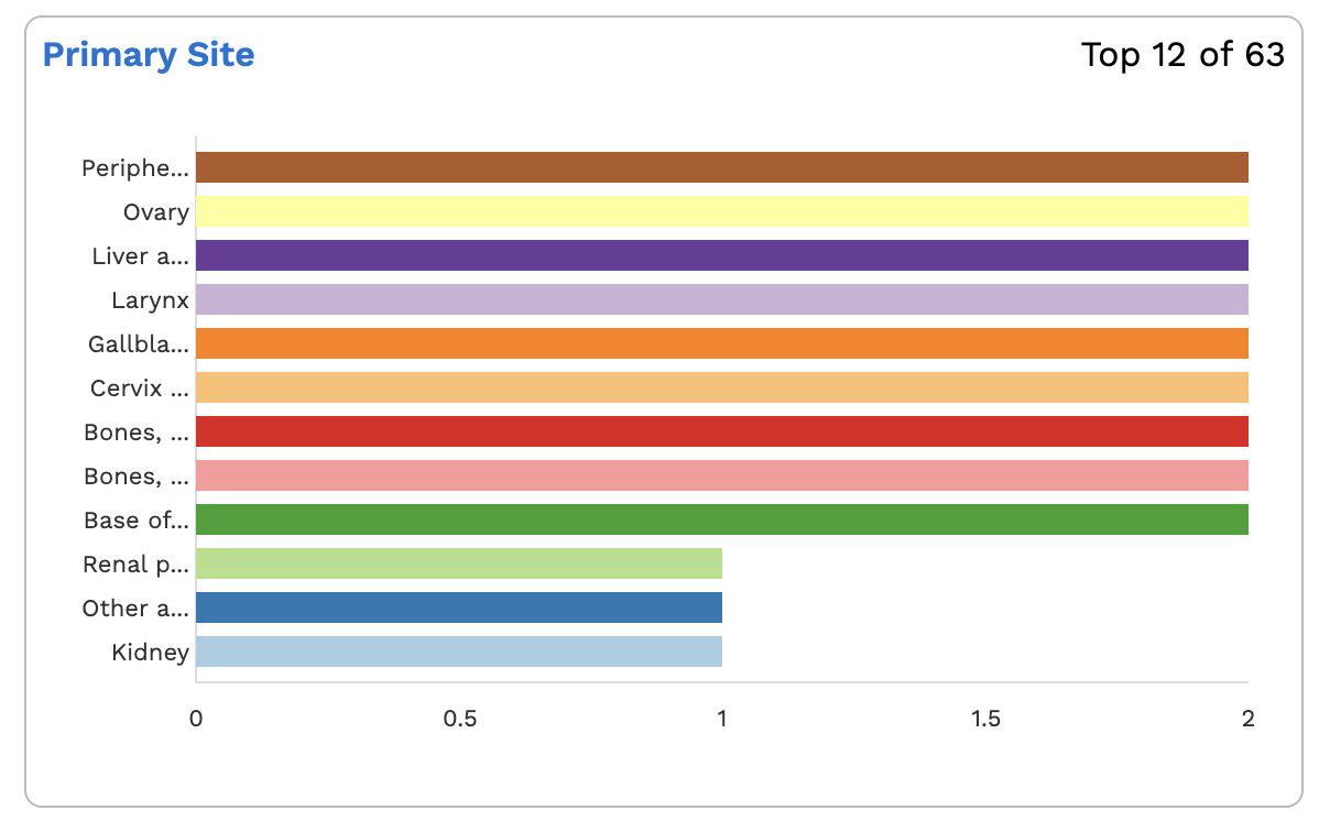
A horizontal bar chart of one field's buckets.
Props:
fieldName(string, required): GraphQL field name to visualize. Nested fields use__for each level (primary_diagnosis__age_at_diagnosis).maxBars(number, required): how many bars to display. Throws if omitted or0.theme(required): chart configuration, merged over the library's defaults and passed to Nivo'sResponsiveBar, so anyResponsiveBarprop can be set hereaxisBottom.legend,axisLeft.legend: axis labelsaxisBottom.customTickValueSize(number): place x-axis ticks at multiples of this value instead of Nivo's four automatic tickssortByKey(string[]): display the bars in this key order. Any bucket whose key is not in the list is dropped, so account for every value the field can take, including__missing__.
ranges(Range[]): required for numeric fields, rejected for categorical ones. See Field types.handlers.onClick: called with the clicked bar;data.label,data.value, anddata.keycarry the bucketdisableTopBarsCount(boolean, defaultfalse): hide theTop N of Mbadge that appears when the field has more buckets thanmaxBars
<BarChart
	fieldName="primary_site"
	maxBars={15}
	theme={{
		axisBottom: { legend: 'Records' },
		axisLeft: { legend: 'Primary site' },
		sortByKey: ['Brain', 'Lung', 'Breast', '__missing__'],
	}}
	handlers={{
		onClick: (data) => {
			console.log('Clicked', data.label, data.value);
		},
	}}
/>
Without sortByKey, the chart takes the maxBars largest buckets and draws them ascending from the axis, so the largest bar is at the top. Bar labels are truncated to seven characters; the full value is in the tooltip.
SunburstChart
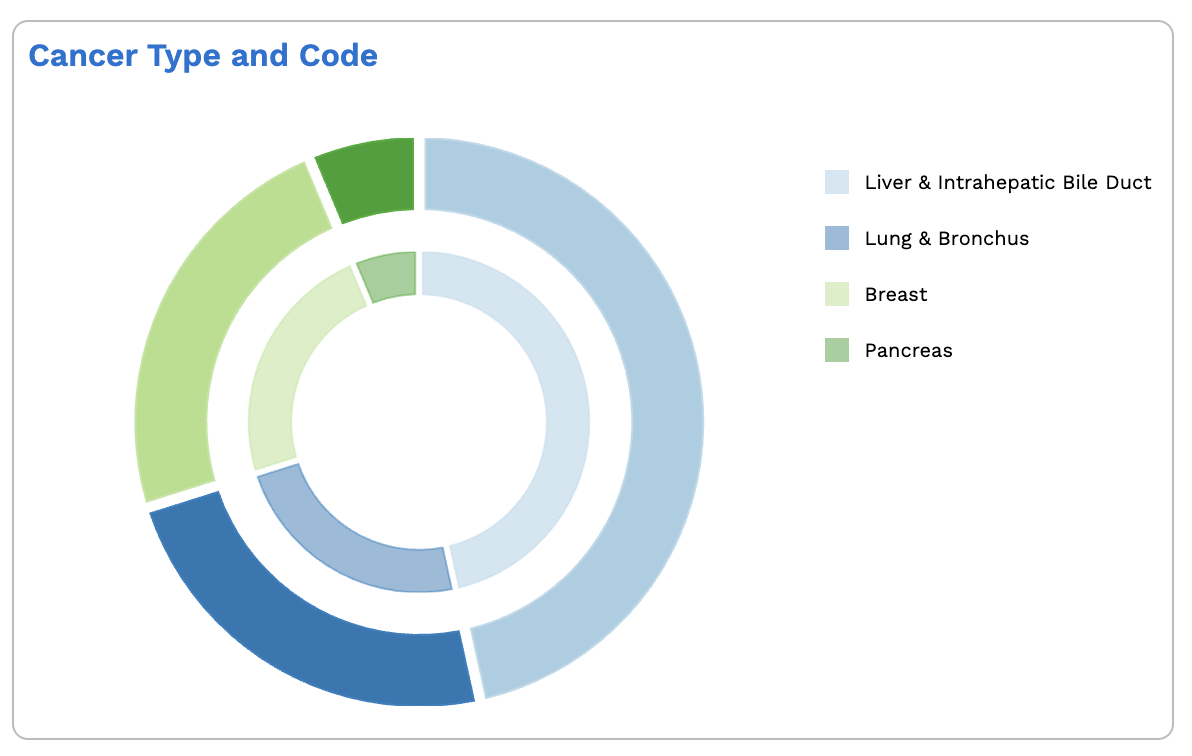
Two concentric rings showing specific values grouped into broader categories. The inner ring holds the categories your mapper returns, the outer ring the field's own values, and the legend lists the categories. A category and its values share a hue, with the inner ring drawn at half opacity.
Props:
fieldName(string, required): GraphQL field name to visualizemapper(function, required): maps one of the field's values to the category it belongs to. Throws if omitted. A value the mapper returns nothing for is left out of the chart, so the mapper doubles as a filter; if it maps nothing at all, the chart renders its empty state.maxSegments(number, required): how many categories (inner-ring segments) to display. Every value belonging to a displayed category is drawn, so the number of outer segments is not capped directly. Throws if omitted or0.handlers.onClick: called with the clicked segment plus anidsarray — the values under a category when the inner ring is clicked, or the single value when the outer ring is clicked, which is what you would feed into a SQON filter
<SunburstChart
	fieldName="primary_diagnosis"
	maxSegments={12}
	mapper={(diagnosisCode) => {
		// Map specific diagnosis codes to broader categories
		if (diagnosisCode.startsWith('C78')) return 'Metastatic';
		if (diagnosisCode.startsWith('C50')) return 'Breast Cancer';
		return diagnosisCode; // falling through to the raw value keeps it in the chart
	}}
	handlers={{
		onClick: (data) => {
			console.log('Selected category:', data.ids);
		},
	}}
/>
Categories are ordered by total, largest first. SunburstChart accepts a theme prop, but nothing currently reads it: the chart's only theming is the palette from ChartsThemeProvider.
NetworkNodesChart
A bar chart of the nodes in a federated search network, one bar per node showing its hit count. It takes no fieldName: it reads the network.nodes part of the response rather than a field aggregation, and asks the provider to include the network query on mount.
Props:
theme(required): as forBarChart, plussortAlphabetically(boolean, defaulttrue). Set it tofalseto sort by hit count descending instead.maxBars(number, default unlimited): how many nodes to displayhandlers.onClick: called with the clicked bar; the label is the node name and the value its hit countdisableTopBarsCount(boolean, defaultfalse): hide theTop N of Mbadge
<NetworkNodesChart
	maxBars={10}
	theme={{
		sortAlphabetically: true,
		axisBottom: { legend: 'Donors' },
		axisLeft: { legend: 'Repository' },
	}}
/>
Field types
Charts resolve a field's type from Arranger's extended mapping and query it accordingly:
| Aggregation type | Index field types | ranges |
|---|---|---|
Aggregations | keyword, text, string, boolean, object, id | not used |
NumericAggregations | integer, long, double, float, half_float, scaled_float, unsigned_long, bytes, date | required |
A numeric field without ranges fails validation and renders the error state, with the reason logged to the console. Note that date counts as numeric here, so date fields need ranges too. A field that isn't in the extended mapping at all is treated as categorical, which is what a misspelled fieldName looks like: no validation error, just an empty or failed query.
Ranges are { key, from, to }, with from inclusive and to exclusive:
<BarChart
	fieldName="age_at_diagnosis"
	maxBars={10}
	theme={{ axisBottom: { legend: 'Donors' }, axisLeft: { legend: 'Age' } }}
	ranges={[
		{ key: '< 18', to: 18 },
		{ key: '18 - 65', from: 18, to: 66 },
		{ key: '> 65', from: 66 },
	]}
/>
Behaviour worth knowing
- One chart per field, per provider. Registration is keyed by field name, so if two charts under the same
ChartsProviderrequest the same field, the second registration is ignored and both render the first one's data. Two charts on one field with differentrangesis therefore not supported: put them under separate providers. - Colours are stable. Each bucket key keeps its colour as data changes, and the assignment is cached in
sessionStorageunderarranger-charts-<fieldName>, so it survives a remount within the browser session. - Records with no value appear as a bucket labelled
No Data(__missing__insortByKeyand in the raw data). SetdisableIncludeMissingon the provider to leave them out. - Counts of 0 still draw a bar. A zero-count bucket renders a minimum-width bar whose tooltip reads
Too fewrather than0. - Tooltips are styleable. The built-in tooltip carries
tooltip-container,tooltip-label(with adata-labelattribute), andtooltip-dataclass hooks; theTop N of Mbadge carriestop-chart-bar-items-count. Passing a custom tooltip component is not supported yet.
Debugging
Set debugMode on ChartsProvider to log the data pipeline to the browser console: which fields registered and deregistered, and the aggregation type each field resolved to. It is the first thing to turn on when a chart renders blank, since a field name that doesn't match the extended mapping is reported there as a missing mapping. Validation failures are logged whether or not debugMode is set.