Viewer Setup
This guide covers embedding the Lectern Viewer in a React application: installing the package, pointing it at a dictionary source, and configuring filters, columns, and theming. For what the resulting views show a reader, see the Viewer overview; for the complete export listing, see the Reference.
Run Storybook
The library is developed with Storybook, which renders each component in isolation. It is the fastest way to see what the library offers before wiring anything into an application, and every component has stories covering its states, including loading, error, and empty-dictionary cases.
-
Clone the Lectern repository and install dependencies from the repository root:
pnpm install -
Start Storybook:
pnpm --filter @overture-stack/lectern-ui storybook
Storybook runs on port 6006 by default: http://localhost:6006/.
Stories render under a themeDecorator, and a theme selector in the Storybook toolbar applies an alternate theme to every story that uses it, which is useful for checking that a component reads the theme rather than hard-coding values.
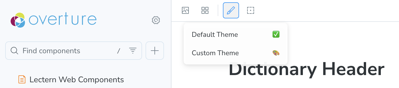
For the full walkthrough, covering adding themes to the selector, wiring the decorator, and editing stories, see the Lectern UI developer docs in the repository.
Prerequisites
- React 19. The package declares
reactandreact-dom^19.1.0. - A dictionary source. Either a running Lectern server, a dictionary JSON file served over HTTP, or dictionary objects already in your application.
Install
npm install @overture-stack/lectern-ui
mainThe published 1.0.0 release predates the custom columns feature, which exists only on main. Everything else on this page is in 1.0.0. The Reference tracks which exports are released and which are not.
Render a dictionary
DictionaryTable is the whole table view wired to a Lectern server. It sets up the data and view-state providers for you, so a minimal integration is one component:
import { DictionaryTable } from '@overture-stack/lectern-ui';

const DictionaryPage = () => (
	<DictionaryTable lecternUrl="http://localhost:3000" dictionaryName="example-dictionary" />
);
DictionaryTable fetches every version of the named dictionary and renders the newest one, with the others available from the version switcher.
Choose a data source
DictionaryTable reads from a Lectern server. To read from somewhere else, compose the pieces yourself: a data provider, the view-state provider, and DictionaryTableViewer.
| Provider | Reads from | Props |
|---|---|---|
LecternDataProvider | A Lectern server. Fetches every version of the named dictionary. | lecternUrl, dictionaryName |
HostedDictionaryDataProvider | A single dictionary JSON file served over HTTP. Validated against the Lectern meta-schema on fetch. | hostedUrl |
DictionaryStaticDataProvider | Dictionary objects already in memory. No network request. | staticDictionaries |
import {
	DictionaryTableStateProvider,
	DictionaryTableViewer,
	HostedDictionaryDataProvider,
} from '@overture-stack/lectern-ui';

const HostedDictionaryPage = () => (
	<HostedDictionaryDataProvider hostedUrl="https://example.org/dictionary.json">
		<DictionaryTableStateProvider>
			<DictionaryTableViewer />
		</DictionaryTableStateProvider>
	</HostedDictionaryDataProvider>
);
The split is deliberate: the data provider owns fetching, validation, and error state, while DictionaryTableStateProvider owns which version is selected and which filters are active. Both expose their state through hooks, useLecternData and useDictionaryTableState, so a platform can build its own chrome around the table.
The Submission Templates button reads from a Lectern server and is hidden for the hosted and static providers. HostedDictionaryDataProvider also validates the fetched JSON and surfaces a parse failure as an error, so a malformed dictionary reports the problem rather than rendering an empty table.
Add metadata filters
filterDropdowns adds toolbar dropdowns that filter out whole schemas based on dictionary metadata. Each entry gives a label and the dot path to filter on; the available options are read from the dictionary, so nothing needs to be listed up front:
<DictionaryTable
	lecternUrl="http://localhost:3000"
	dictionaryName="example-dictionary"
	filterDropdowns={[
		{ label: 'Submitter', filterProperty: 'meta.submitter' },
		{ label: 'Domain', filterProperty: 'meta.domain' },
	]}
/>
Selections combine as OR within a dropdown and AND across dropdowns: picking two submitters shows schemas from either, and also picking a domain narrows that to schemas matching both. A schema whose metadata value is an array matches if any of its values are selected.
Configuring filters also changes the surrounding view: active selections appear as removable pills below the toolbar with a "Reset all" control, schemas carry their metadata values as tags on the accordion header, and a combination that matches nothing renders an explanation with a button to clear the filters.
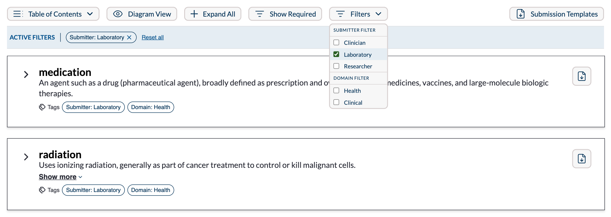
However many dropdowns are declared, the toolbar grows a single Filters control; the menu it opens holds one section per dropdown, headed by that dropdown's label.
Add custom columns
customColumns appends columns to every schema table. Each entry names the column and points at a value on the field with a dot path:
<DictionaryTable
	lecternUrl="http://localhost:3000"
	dictionaryName="example-dictionary"
	customColumns={[
		{ columnHeader: 'FHIR', metaPath: 'meta.mappings.FHIR' },
		{ columnHeader: 'Ontology Ref', metaPath: 'meta.ontologyRef', defaultVisible: false },
	]}
/>
Without a columnComponent, cells use the default renderer, which handles strings, numbers, booleans, arrays, and nested objects, and turns URL values into links. Readers can show and hide these columns from the toolbar's Columns dropdown; defaultVisible: false starts a column hidden.
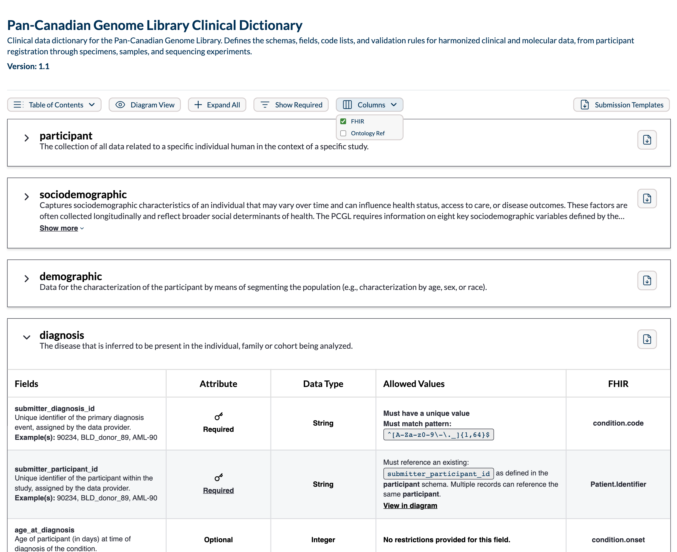
The screenshot is the configuration above: FHIR is visible and Ontology Ref, declared with defaultVisible: false, is not.
To control rendering, pass a component instead. It receives the whole field alongside the resolved value, so a cell can fall back to other field properties:
import type { CustomColumnComponentProps } from '@overture-stack/lectern-ui';

const FhirBadge = ({ value }: CustomColumnComponentProps) =>
	value == null ? null : <span className="badge">{String(value)}</span>;

const columns = [{ columnHeader: 'FHIR', metaPath: 'meta.mappings.FHIR', columnComponent: FhirBadge }];
See CustomColumnConfig for the full type. This feature is on main and not in the published 1.0.0.
Apply a theme
Components style themselves with @emotion/react, which ships as a dependency of the package. An application built on a different CSS-in-JS library can still mount the components, but theming goes through Emotion.
Every Lectern component reads its styling from a ThemeProvider. When no provider is present, components fall back to defaultTheme. A provider can override any part of the theme (colours, typography, dimensions, icons), and overrides are deep-merged into the default rather than replacing it, so partial themes are valid:
import { DictionaryTable, ThemeProvider } from '@overture-stack/lectern-ui';

const ThemedDictionaryPage = () => (
	<ThemeProvider theme={{ colors: { accent_dark: '#0b75a2' } }}>
		<DictionaryTable lecternUrl="http://localhost:3000" dictionaryName="example-dictionary" />
	</ThemeProvider>
);
Components read the active theme with the useThemeContext hook, which is exported so integrators can build their own components against the same theme.